Saturday, 22 October 2011

Communications


The first component of the course, model making, was one in which I struggled. With no previous model making experience it was definitely a steep learning curve. I began using the wrong glue and knife; however by the end of the four weeks, I was a much more competent model maker. Furthermore, I believe my final model for the Montage component is testament to my progress in this skill.


As was model making, Draw-it was another time consuming project. However, due to a background as an artist, my basic skill set was already established, allowing me to produce neat and clean architectural drawings. On the other hand, the rendering component of this course was my downfall. My renders were not up to the standard of my original drawings, however have allowed me to gain an insight into how to ‘give life’ to architectural drawings.

The third and final component of the course, Montage-it, was the one I found to be less useful and challenging then the previous two. Even though the conceptual challenges posed at the beginning may have had myself and others stumped at first, they were relatively easy to get around. A reason for this may be the skills gained in model making and drawing allowed me to competently build a model, represent it in a flip book, and then place it in an appropriate location. Similarly, my overall improvement is elucidated by comparing my first poster to my other two.

Wednesday, 15 June 2011

Google Warehouse

Objects

http://www.2shared.com/file/6UoTU0xl/arm1.html
http://www.2shared.com/file/T5MxXEcS/bridge_top.html
http://www.2shared.com/file/2mdi2LED/bridge.html
http://www.2shared.com/file/BvqpizWr/chair.html
http://www.2shared.com/file/ocQAJpJ4/gaga2.html
http://www.2shared.com/file/jXOgppUZ/gagalifttail.html
http://www.2shared.com/file/uAXwzrcw/gagalifttriangle.html
http://www.2shared.com/file/I5gjX2oS/oprah.html
http://www.2shared.com/file/qa3YZsPS/oprahlift3.html
http://www.2shared.com/file/6wUBOCZj/seat2.html
http://www.2shared.com/file/4dPPt_M0/tabe.html
http://www.2shared.com/file/D02WWY4R/table_base.html
http://www.2shared.com/file/ax9xyGYf/table_top.html
http://www.2shared.com/file/t0ORqF3Z/tower3.html

Levels

http://www.2shared.com/file/5t7t4JX9/3372842_EXP3_Level1.html
http://www.2shared.com/file/92r-Hjmy/3372842_EXP3_Level1.html
http://www.2shared.com/file/HnlM2hw9/3372842_EXP3_Level1.html
http://www.2shared.com/file/mUDMEiwh/3372842_EXP3.html
http://www.2shared.com/file/VP9CDWdh/3372842_EXP3.html
http://www.2shared.com/file/GxBc4l99/level.html
http://www.2shared.com/file/dPUwTmcl/terraintexture.html

Final Images

Oprah's elevator in operation:
The basic objects used to create her elevator further espouse how Oprah has achieved power by being down to earth and transparent. These shapes illustrate how nothing more than the basic human fundamentals are required. Put simply, all small things, ground in good intentions, grow into bigger things.

Bridge structure

View from Oprah's side

The architecture of the meeting space again has been designed to accommodate both clients. The idea of 'passive architecture' was at the forefront of this space, as both clients must leave their respective customised offices behind and acclimatise to a neutral space.


The organic design of the base of the meeting table is the most important aspect of this space as it is reflective of the foundations both clients and their respective character traits were built upon. Henceforth, the resulting object, which harks back to the notion of 'tree roots', again espouses how both characters intrinsically achieve power by being true to themselves.


The design of Lady Gaga's office stems from one of her eccentric outfits and is reflective of how she has achieved this notion of power by not conforming to the standards set by society. The design is holistically unpractical and would not make effective use of many amenities of design, effectively elucidating Gaga's persona. Her outlandish behaviour, which poses many questions but offers no definite answers acts as a critique to pop culture and is a social commentary on society. Her office space, consisting of a variation of triangles set at different, acts as an extension to her powerful, ever-changing persona.

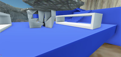
As the bridge has been built with both clients in mind, it is appropriate that the essence of its design incorporated the theme of being 'true to form.' This theme is reflective of the clients achieving power by being true to themselves, albeit in contrasting ways.
The exposed structural frame of the bridge represents the openness of both characters. The seemingly 'crazy' elements at the centre are reflective of Lady Gaga's frivolity and extravagance. On the surface, these poles, just like Gaga, appear to be devoid of meaning. However on closer observation it is evident that they do indeed serve a structural purpose, akin to Gaga's underlying ridicule of Pop culture.  Contrastingly, the open nature of the frame is reflective of Oprah's nature. It consists of several simple elements, however when combined, forms a strong and sturdy structure. 

Contrastingly, the design of Oprah's office espouses how she has achieved her powerful status through being open, honest, and true to herself. Her office space, consisting of a series of cubic rooms, were specifically designed to be open on all sides in order to reflect how Oprah has been honest in her words and actions. Her truthful nature, whereby she has confronted, shared and overcome issues about her past which many of us would choose to ignore, is what separates her from the everyday person. Her position high in the sky is not reflective of superiority, moreover her status as a respected citizen of society. Similarly, the design for the towers which flank her office space further support this fact as their vertical nature are a reflection of her upstanding character.


View from meeting space


Lady Gaga's elevator is outlandish, however represents how crazy designs can grow from the repetition and variation of the same theme. Her power (symbolised through her dress) stems from simply using common everyday objects in a new way that hasn't been tried before.   

Tuesday, 24 May 2011

Textures

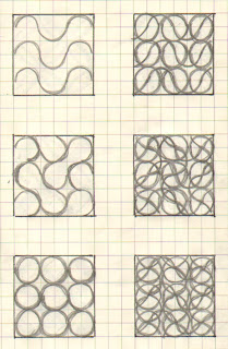
Rotational
Scalar Translation
Linear
Natural - the function of movement is built upon the foundations of all natural body mechanics. 
Motif - In a manner akin to movement, the word 'motif' elucidates repetition and variation of the theme.  
Progression - Follows the same notions of movement, whereby previous actions are built upon in order to create the idyllic outcome.

Two Point Perspectives

Humble

Pedestrian

Superior

Inferior

Reserved

Ostentatious

Subordinate

Meek

Grandiose

Mediocre

Middling

Lofty

Subsidiary

Docile

Condescending
Ancillary

Passive

Brazen

Wednesday, 18 May 2011

MashUp

Defying all of the preconceptions we have, I only wish more people were watching. The point isn’t merely to entertain, but to provoke response and discussion. In that moment, which melds unique creativity with the nuts-and-bolts required to make beautiful things, there’s an intimate connection. Nothing can be compared to in terms of its reach.
It's amazing ability to dazzle and delight guarantees best-seller status. I love the fact that it has such an iconic look, showing that design can be a valid business model. The three-year gestation has been unusually arduous, yet created and maintained a choke hold on the market. I channel that more so than anything else.
Iconic and powerful, Skeptics venture abound. The most unique weapon when it comes to innovation, its success hinges on fans being able to convince the world that it’s great. Commanding premium prices from advertisers, the design magic is definitely provocative. The stakes couldn’t be higher.
Cutting quite a figure as it stands out a mile, the clean post-industrial look has etched itself into the culture.
Referencing
·         Lady Gaga (Red) - 'Times Online', Lady Gaga: The Future of Pop,  December 14th, 2008  http://entertainment.timesonline.co.uk/tol/arts_and_entertainment/music/article5325327.ece
·         Oprah Winfrey (Black)  - 'The New York Times', Oprah Winfrey, Sara Krulwich, May 25th, 2011  www.topics.nytimes.com/top/reference/timestopics/people/w/oprah_winfrey/index.html
·         Jonathan Ive (Blue) - 'Bloomberg Business week', Who is Jonathan Ive, September 25th, 2011  

The Grand Canyon


First image capture of valley

One Point Perspectives

Pedestrian

Humble

Superior

Inferior


Reserved

Ostentatious
Subordinate

Meek

Grandiose

Mediocre


Middling
Lofty

Docile


Subsidiary
Condescending

Ancillary

Passive

Brazen